Let the Colour Wheel help you in your card making
Interior designers all know the benefits of a colour wheel, but it is a useful tool that can help you in your card making too.
It will help you to pick and choose the colours that go together to make your creations look stunning.
It is made up with different areas and each is achieved by mixing colours together.
There is a short video that may also help you with making these choices and you will find it here
PRIMARY COLOURS
These are the pure colours and cannot be made from mixing any others. They are
Red, Yellow and Blue


SECONDARY COLOURS
Secondary colours are made from mixing together equal parts of the primary colours.
Red + Yellow = Orange
Red + Blue = Purple
Blue + Yellow = Green
TERTIARY COLOURS
These are achieved by mixing the primary and secondary colours together in a 2:1 ratio.
Red-Orange
Red-Violet
Yellow-Orange
Yellow-Green
Blue-Violet
Blue-Green
Most colour wheels are based on the three primaries, three secondaries and the six tertiaries.
Modern wheels can have many more intermediate colours added in, and a decorators wheel will have all the paint colours supplied by the company.
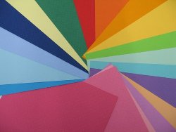
This swatch shows just some of the many colours of card available to you.
There are some interactive applications available on the internet which are used by artists and designers. But a simple wheel is all you need to help with card making.
On one side of the wheel will be the cool colours, (blue green and purples,) with the hot palette, (red, orange and yellow) on the other.
You will find many different types of colour wheel that you can buy, or even make your own, on the internet and one of the cheapest ones is from Amazon
This one also shows you how the colours change if white or black is added to the mix which can be very useful when it comes to highlights and shading
Accent colours
An accent is used in small quantities to lift a scheme. Use them in complimentary colours if you are afraid of strong colours.
Just add a splash in a flower, some ribbon, or a few gemstones, brads or buttons.
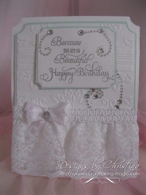
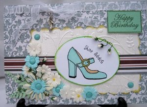
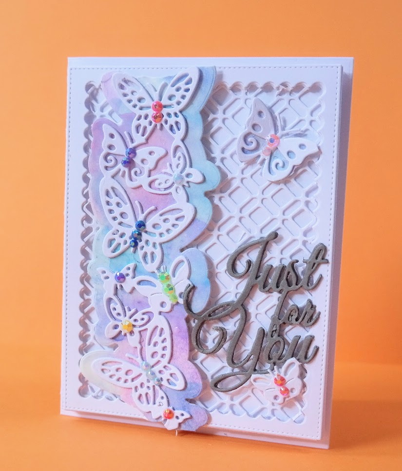
Here a very pale shade of green has been used to compliment the white for a very elegant effect
Clashing colours
This kind of combination used to be frowned upon, but these days anything goes.
If used carefully they can look fantastic together.
Look at the things in nature to inspire you.
In my garden there are bright yellow Irises which sit alongside a deep purple Geranium and they look amazing
Monochromatic colours.
This is using just one colour but in several different tones or shades.
This is really a lovely effect especially if different patterns are used at the same time.
As long as the colours blend you will not go far wrong. Using all the same tone would make your card look bland.
Harmonious colours
Harmonious colours sit next to each other on the wheel, or very close.
For example purple...is close to lavender...is close to lilac.
It is easy to create a balanced scheme using harmonious colours.
Complimentary colours
These are opposite each other, and can also be used to great effect.
Choose one to use the most of and a second one in smaller quantities.
If you use them both in equal measures they will fight each other for attention.
A third colour can be used if you need to, but try not to add more than three.
Mood Board
Interior designers use "mood boards" when putting together a room scheme.
Take a look at the sketches page, which is a scaled down idea of a mood board.
This is just laying out all the elements you want to include in your card.
See what you like before you start licking and sticking and that way if you don't like the result then nothing is wasted.
Just start again until you are happy, and use the colour wheel to help you choose your colour scheme.
Neutrals
The easiest group to work with are the neutrals, but they don't appear on a colour wheel.
They consist of what are known as non-colours and they are black, white, brown, grey and beige.
They are also used to mix in with the other colours to produce different tones and shades.
They all go together and can be layered and matched, with no one of them dominating the other. Try using these with one accent colour for a dramatic effect.
Colouring In
Easy cardmaking projects
More Projects
Novelty Cards
Kinetic Cards
Papercrafts
Using Sketches
Making a Template
Return from Colour Wheel to Homepage


Recent Articles
-
Memory Book
Oct 15, 22 09:17 AM
 Make a memory book, fun to make and even lovelier to give.
 -
Die cut letters.
Jul 19, 21 10:12 AM
 Add that personal touch with die cut letters, add names or sentiment as you please.
 -
Diaper Fold Card.
Jul 19, 21 09:34 AM
Create this fun Diaper Fold Card...and no need for a pin!
Search
