June is Busting Out ....Half way through the year already and your cardmaking is still giving you lots of pleasure I hope...Yes? Oh good! It's a well known fact that male cards are notoriously difficult to do, and the next "Big" event in the cardmakers calender is
Fathers Day.  But if you stay away from pinks and flowers, then it shouldn't pose too much of a problem.
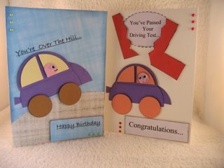
 (Unless you're like me and love pink and flowers, and then you'll get withdrawal symptoms...) Knowing the recipeint helps, of course, as you know what your dad likes and dislikes. Try some of the different shaped cards, like The Easel Card... The Flip Card ... Or the Stepper Card... as these will add the "Wow" factor your creations.
And if you prefer them as a video tutorial, you will find the steps for each of these three cards
Here And there is nothing to stop you adding pearls or gemstones to jazz it up a little. Add a suitable sentiment to the card, and leave off the "L" plate.
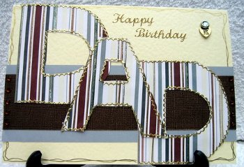
Use a suitable male colour scheme and write out the letters that you need to spell DAD, father, pops or any other name you use for your dad. Either freehand or use a stencil, then add them to the card with foam pads. Decorate with peel offs, or do like I have and doodle around the edge of the card. Leave off the "Birthday" sentiment and replace it with one that tells your dad what he means in your life.
The software that I have is very basic...and so are my designs at the moment. But I intend getting better. To see what the response to these papers would be I sent them out to just a few people... just as a trial ... and I asked for some feedback. My designer friends fell about laughing at my attempts, but the rest of the response was pleasantly surprising. It ranged from .."Yes they are nice" to real exuberence at my efforts They are in a PDF format so they are very easy to download and print off. Most people said that the colours where close to the screen view, but of course the paper, the printer and the ink you use can all make some differences. But many asked for thinner stripes, and also plains, checks, spots and florals, as well as other designs. So it looks like I have my work cut out in the months ahead.
Eventually I will upgrade to a more sophisticated design programme and then there will be no stopping me. Once the papers are ready I will add them as a link to a newsletter....probably the next one...and then you can use them as you wish. And of cousre it goes without saying that any further feedback would be much appreciated. So watch out for the "Add a Little Stripe to your Life" folder...coming soon!! I like to answer all the letters I get, so please keep them coming. A special thank you to those that took part in the trials for the papers, your suggestions, advice and requests have all been taken note of. I will try to give you what you have asked for, but it all takes time....so please be patient with me while I learn. Best wishes
New! CommentsHave your say about what you just read! Leave me a comment in the box below. |